Together with a team of three other fellow computer science students and three business students, I designed, built, and tested a website intended for the submission of tickets for technology-related problems. A key idea behind the project was “Uber for IT”.
The other three developers, John Higdon, Cody Evans, and Lars Norine, each handled some other aspect of the website, typically backend development (database configuration and data management) while I usually focused on designing the website. On occasion, I would write code for the backend. A majority of the design work you see below were my own contributions—this includes page layout and images. At the core of the design process is the Bootstrap 4 style system, which allows near-seamless mobile integration. This allowed me to focus more on the overall look of the site as opposed to optimizing it for both mobile and desktop platforms.
An essential site feature was to separate the user experience between “technicians” and “users”; the former would solve issues submitted by the latter. To achieve this goal, the website was assembled in such a way that all people who sign up for the website start as plain users; a button is available on every user’s profile page to sign on as a technician, at which point all site features (both submitting an issue ticket and browsing tickets that remain unsolved) will be available for them.
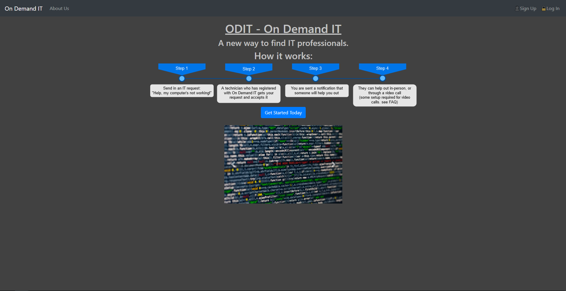
The ODIT landing page. Users must first sign up to use the website in its entirety.
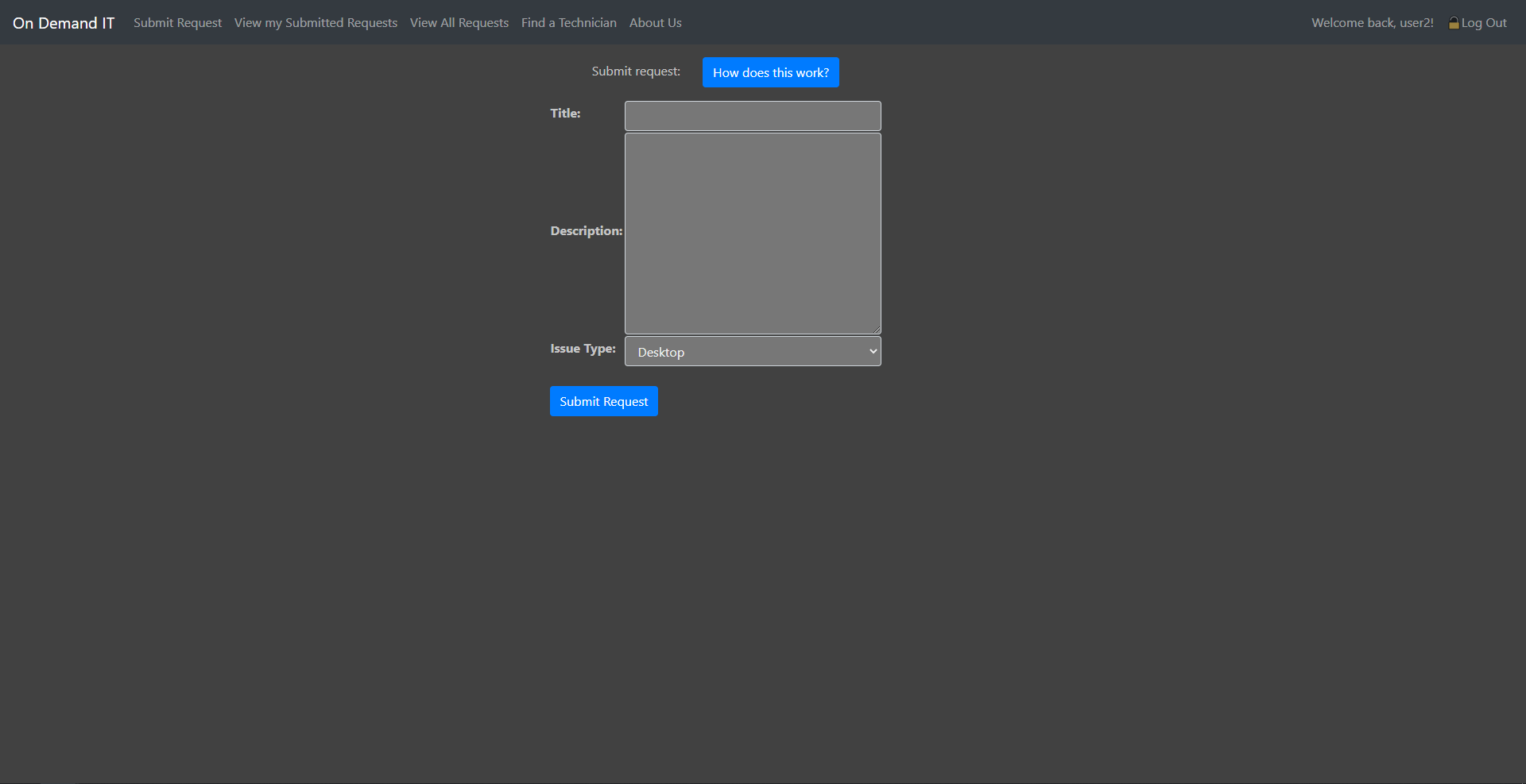
The user issue submission form
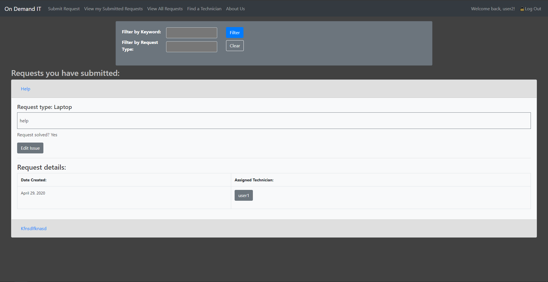
A page to list all requests that the current user has submitted
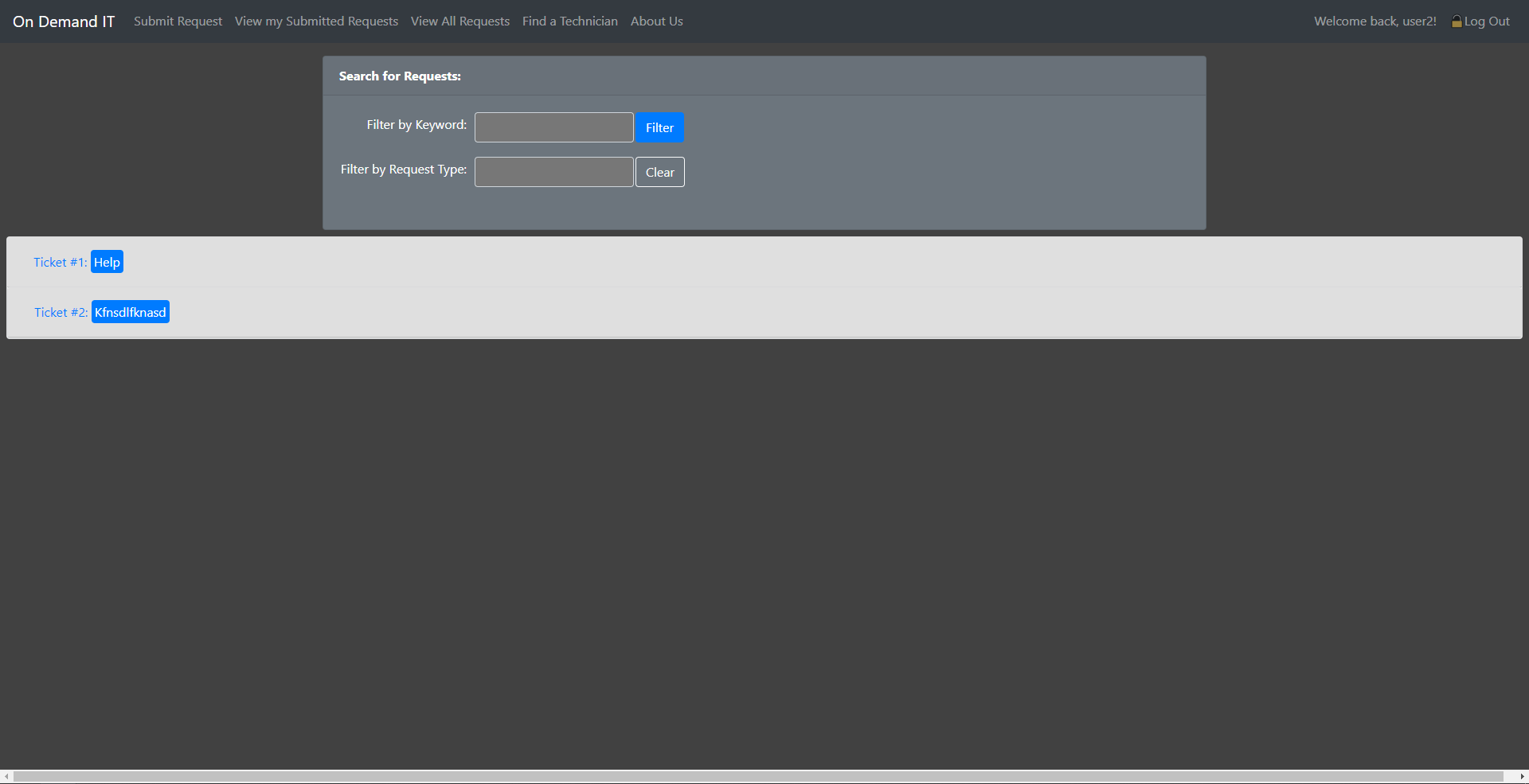
A list of all open requests made by all users. Technicians are able to assign themselves to an issue of their choice.
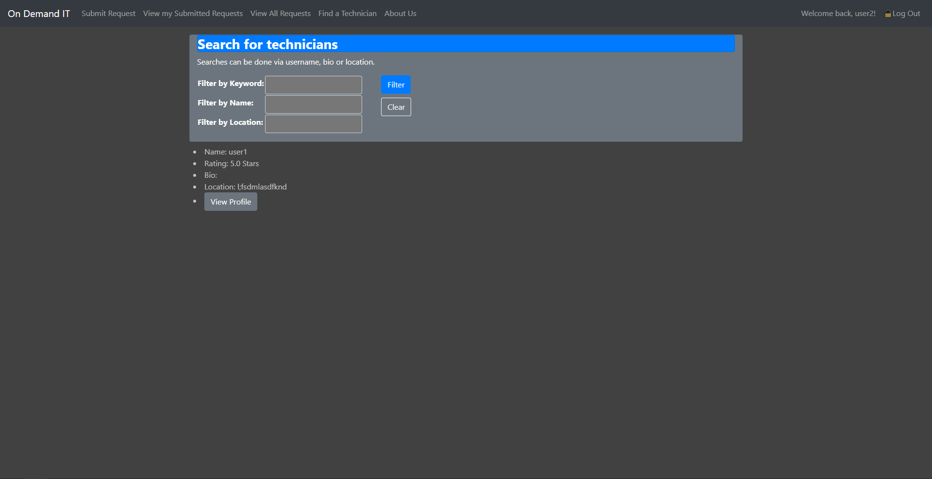
The technician search page. Any user of the site may search for technicians.
A general overview of each technician is automatically generated from site records.
